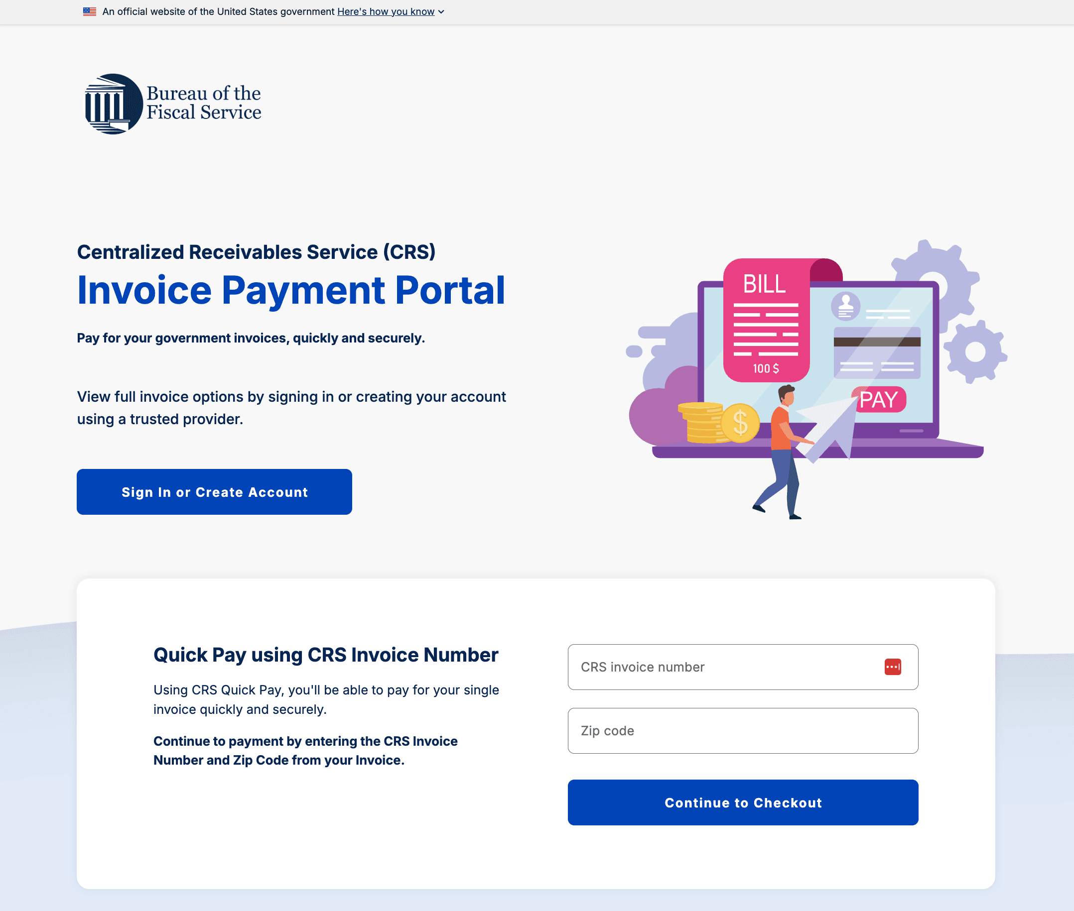
CRS 2.1 modernized the U.S. Treasury's Invoice Payment Portal with an enhanced user experience, redesigned interface, and expanded functionality. Partnering with another designer, we defined the design system and redesigned the Portal experience to improve usability, consistency, and accessibility across devices.
Project Overview
My role: UI/UX Designer
Project status: 7 months
Team: Partnered with UX Designer, Product Manager, Product Owner, Engineers
Tools: Figma (Design and FigJam), Jira


Wide audience: CRS serves a broad range of users, including individuals and businesses with varying levels of technical proficiency. The experience needed to be intuitive and easy to use for all users.
Public trust: As an official U.S. government service, the Portal needed to convey credibility, security, and reliability while maintaining user confidence throughout the payment process.

No existing design system: The platform lacked an established design system, requiring visual standards, UI components, layouts, and content patterns to be created from the ground up.
Complex data and limited screen space: Users needed access to detailed invoice and payment information across devices. Presenting complex data clearly—particularly on mobile—required careful information hierarchy and responsive layouts.
Established direction: Core requirements, user flows, and wireframes had already been established, while federal review and approval processes limited opportunities for significant changes later in the design cycle.


Designing for trust and accessibility
As an official U.S. Treasury service, the CRS Portal needed to serve a broad audience while establishing trust and confidence throughout the payment process. Users varied widely in age, technical proficiency, and accessibility needs, requiring an experience that was clear, intuitive, and inclusive. Through thoughtful information hierarchy, intuitive interactions, and consistent visual patterns, I helped create a professional and approachable experience across devices.

Establishing the design system
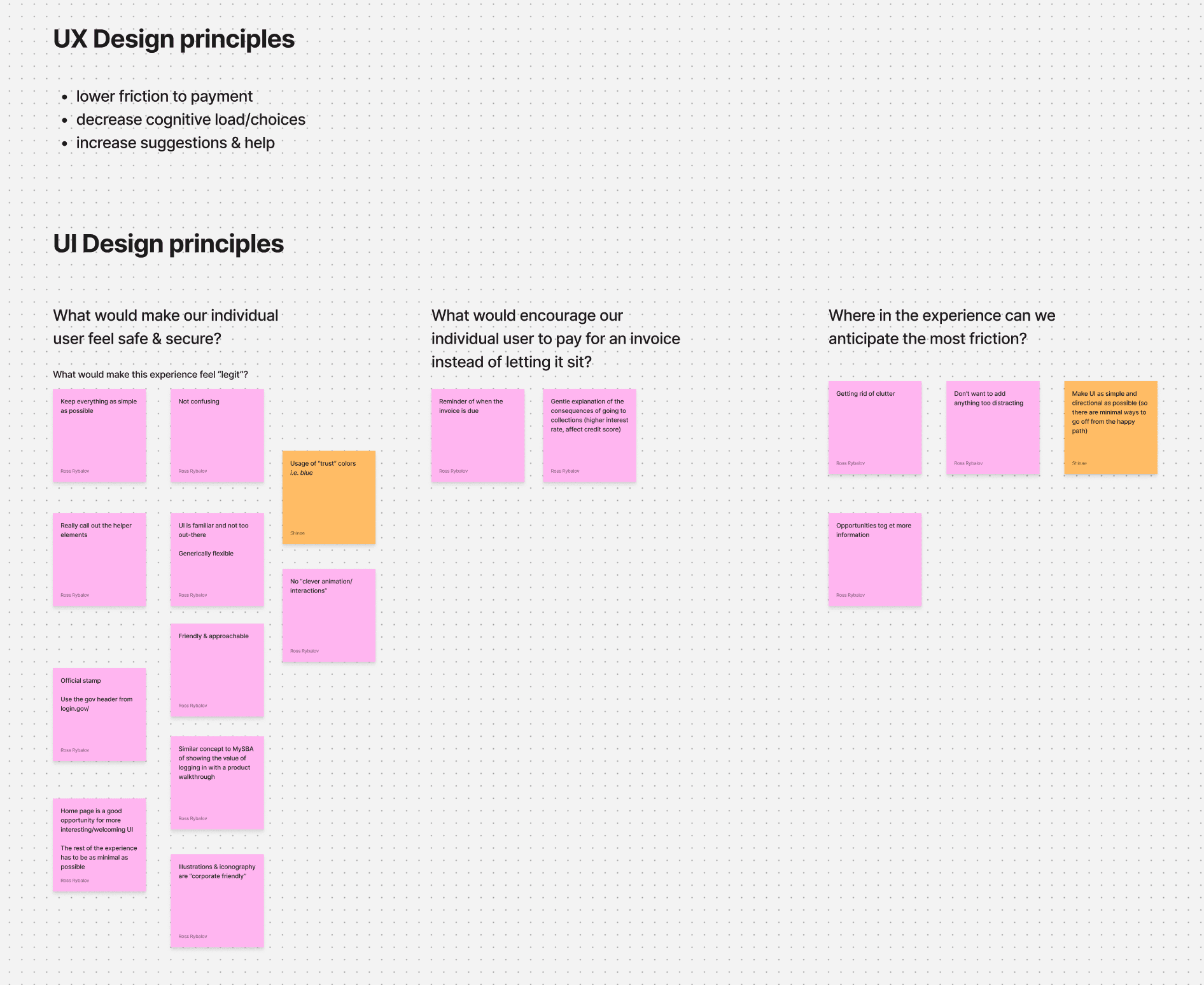
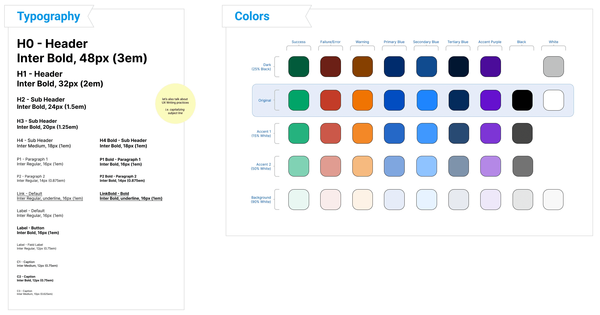
At the start of the project, CRS lacked a formal design system or visual standards, requiring much of the visual foundation to be created from the ground up. Working alongside the UX Designer, I helped establish a design system that translated the project's UX principles into consistent, production-ready interfaces.
The design system included typography, color palettes, UI components, page structures, visual language, and content standards. Guided by UX principles and accessibility considerations, these patterns ensured consistency across workflows while creating a scalable foundation for future expansion.

Managing complex information
The CRS Portal needed to present detailed invoice, payment, and account information while remaining easy to navigate across devices. Balancing information density with readability was particularly challenging on mobile, where limited screen space required a more deliberate approach to hierarchy and layout.
To improve scannability, I organized information into clear sections, prioritized the most important data, and used consistent patterns to help users quickly understand and act on their information. Responsive layouts ensured that critical details remained accessible across screen sizes without sacrificing clarity or functionality.
Building the Experience
With the design system established, I transformed existing wireframes into polished, high-fidelity interfaces for web and mobile platforms. Applying consistent patterns, layouts, and content standards helped create a cohesive experience throughout the Portal. From invoice search and payment workflows to account management and confirmation screens, each interface was designed with clarity, usability, and accessibility in mind.


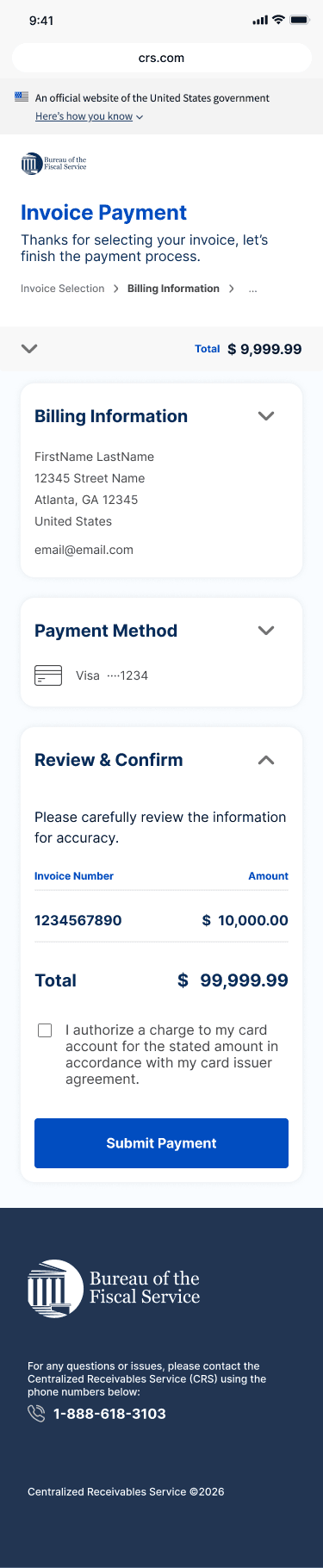


The final high-fidelity screens, ready to go into production